Art Deco Style Window, Modern Two, Edinburgh
Posted in Architecture, Art Deco at 22:23 on 28 September 2022
This window is in the gents’ toilet at Modern Two (Scottish National Gallery of Modern Art). I love its geometric style.

Posted in Architecture, Art Deco at 22:23 on 28 September 2022
This window is in the gents’ toilet at Modern Two (Scottish National Gallery of Modern Art). I love its geometric style.
Posted in Architecture, Art Deco, Edinburgh at 20:30 on 4 August 2022
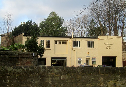
Edinburgh Art Deco Style – flat roof, cream render – as seen from car park of Modern Two, Edinburgh.

Posted in Art, Edinburgh, Sculpture at 12:00 on 28 July 2022
Earlier this month we took in the Barbara Hepworth Exhibition at the Scottish National Gallery of Modern Art, Modern Two, Edinburgh.
The Exhibition is entitled Barbara Hepworth, Art and Life and is open till 2/10/2022.
As well as sculpture, for which Hepworth is most famous, there are some of her paintings on display. In the first room this one reminded me of Mondrian:-

Photograph of Contrapuntal Forms, a Hepworth sculpture displayed at the Festival of Britain’s South Bank site in London. Part of the Skylon can be seen in the background:-

Room 2 had more early paintings. Apologies for the picture quality. I didn’t use flash as I assumed it wouldn’t be allowed:-

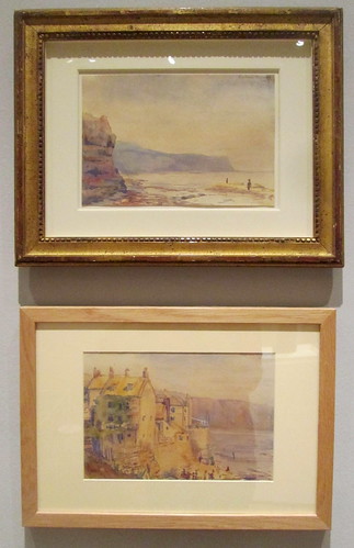
These watercolours are very good:-
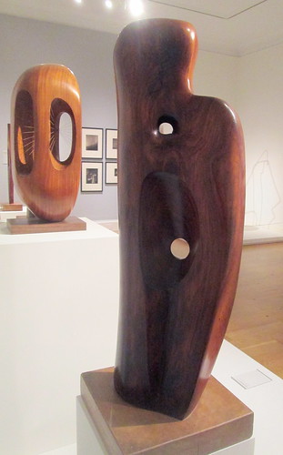
Also in room 2, some typical Hepworth sculptures:-

The leftmost one above, Dyad, caught the good lady’s eye:-

During World War 2 Hepworth’s access to sculptural materials was limited. This is one of the sketches she made as preparation for a sculpture:-

She even designed textiles:-

An ovoid sculpture with her characteristic smooth curves and voids:-

A more traditional sculpture but still with her distinctive curves:-

Orpheus. An example of her use of strings. (See also background of Dyad, above):-
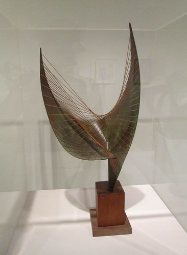
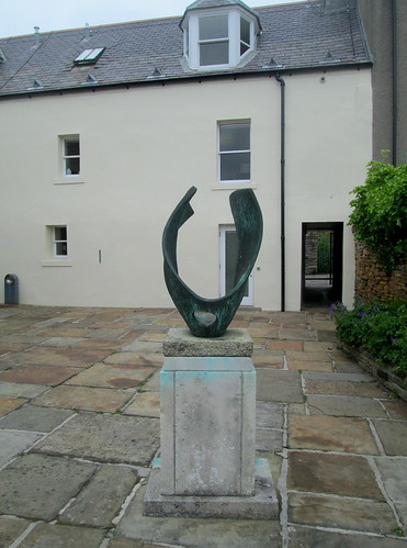
Thsi one seems to be very similar to one I photographed outside the Pier Art Centre, Stromness, a few weeks before:-

In Stromness:-

Photograph of Winged Figure, John Lewis, London:-

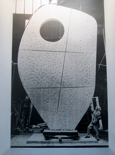
Photograph of Hepworth beside one of her sculptures:-
Posted in Art, Other fiction at 20:30 on 9 November 2020
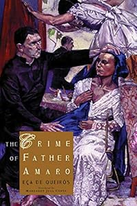
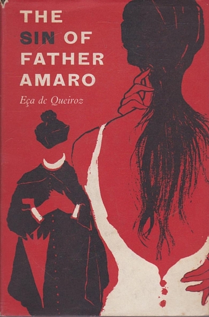
I confess I had never heard of Josa Maria Eça de Queiroz (or José Maria Eça de Queirós) – the full name of the Portuguese author one of whose books I am reading at the moment (see sidebar until I move on to another book) – until earlier this year when we attended an exhibition of the paintings of Portuguese artist Paula Rego at the Modern Two part of the Scottish National Gallery of Modern Art. In the gallery shop my eye was taken by copies of de Queirós’s The Crime of Father Amaro (an alternative title) whose cover (see below, left) incorporated one of Rego’s paintings. I had never read any Portuguese literature so took note of the book, but not so much as to make a purchase there and then as I wanted to find out more about the author first. de Queirós turns out to be one of Portugal’s most respected writers and there are several editions of this book in translation besides the one I bought.
So it was that earlier this year on coming across a copy of The Sin of Father Amaro in my favourite second hand bookshop – Bouquiniste, in St Andrews since you ask – at a bargain price, I could not pass up the chance to sample de Queirós’s work. I must say though, that the covers of most editions do give the game away somewhat as to what the nature of Amaro’s crime – or sin; take your pick – might be. They leave nothing to the imagination. In fact only the Rego cover doesn’t. The others are also more than a little misleading in that the female character they attempt to depict is far from the apparent temptress that especially the right hand one might suggest.

Posted in Art, Edinburgh, Exhibitions at 12:00 on 16 August 2018
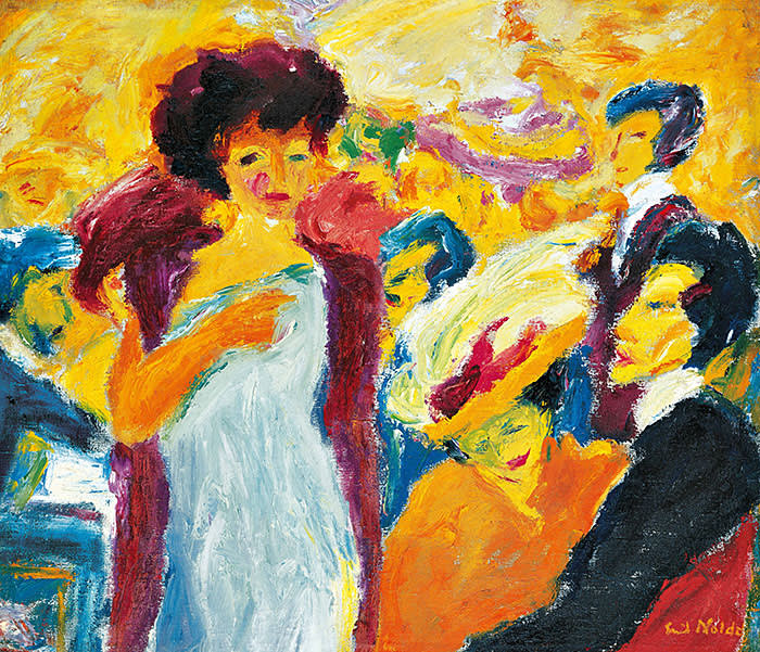
The art exhibition with the above title is on at ModernTwo (The Scottish National Gallery of Modern Art,) Edinburgh until 21/10/2018.
Nolde was born in a part of Germany that became Danish after a plebiscite in 1920 (though had presumably been Danish before the war of 1864) thought of himself as German yet retained Danish citizenship.
I noticed at the entrance that the gallery felt it had to emphasise it in no way endorsed Nolde’s anti-semitic views.
Despite those views and his membership of the Nazi party Nolde’s works were the single most withdrawn from museums by the Nazis (1,052 works) and the most represented in their Degenerate Art (Entartete Kunst) Exhibition, which managed to draw huge crowds – some of whom were quite enthusiastic about the contents.
I found myself not knowing quite what to make of Colour is Life. Some of the paintings were undoubtedly grotesque like Paradise Lost, Adam and Eve after expulsion from the Garden of Eden
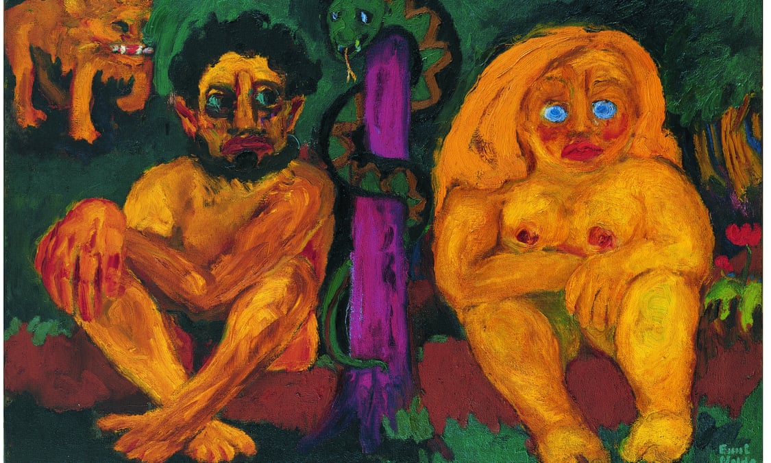
and his Immaculate Conception (which I cannot find an example of to embed here) showing the mother of Jesus in an attitude of ecstasy as the Holy Spirit hovers nearby is in a similar style only more so.
Others are reminiscent of Toulouse-Lautrec posters, only more garish:-
On the other hand some of his pen and ink drawings reminded me of the Rembrandt ones in the exhibition at the Scottish National Gallery.
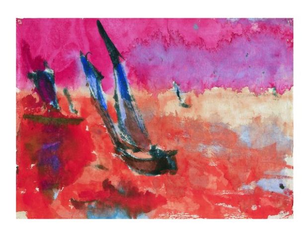
His depiction of the sails in one of his paintings of junks looked like Japanese calligraphy. I’m not sure I’ve found the exact match, the original image of the one below is apparently copyright so this is only a thumbnail:-
This is a more colourful version of a similar subject:-
The introductory video from the exhibition’s web page is also on YouTube:-
Posted in Art, Bridges at 20:00 on 29 March 2018
We’ve been to the New Era exhibition of Scottish Modern Art 1900-1950 at the Scottish National Gallery of Modern Art (Modern Two.)
It’s not quite as good as the previous exhibition True to Life (for which I see some of the links to the paintings are no longer working) but there is still some good stuff there.
More so in the first two galleries. The pictures became darker both in tone and appearance as the galleries wore on.
Stanley Cursiter’s “The Regatta” is particularly striking with its bold slabs of colour:-

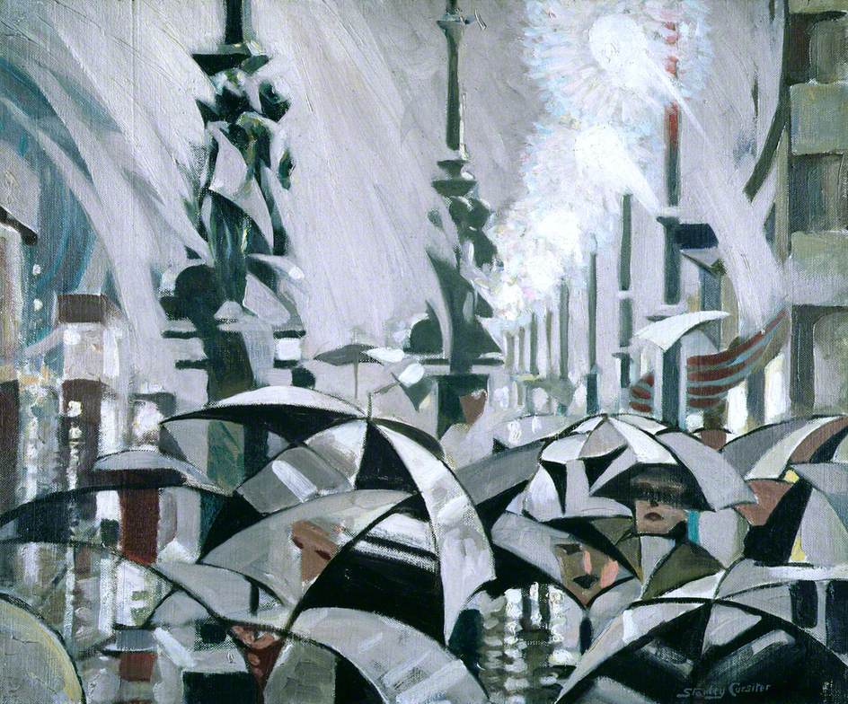
Cursiter’s “Rain on Princes Street”:-
J D Fergusson is more usually reckoned a colourist but though not an official war artist he was allowed to paint Portsmouth Docks during the Great War.

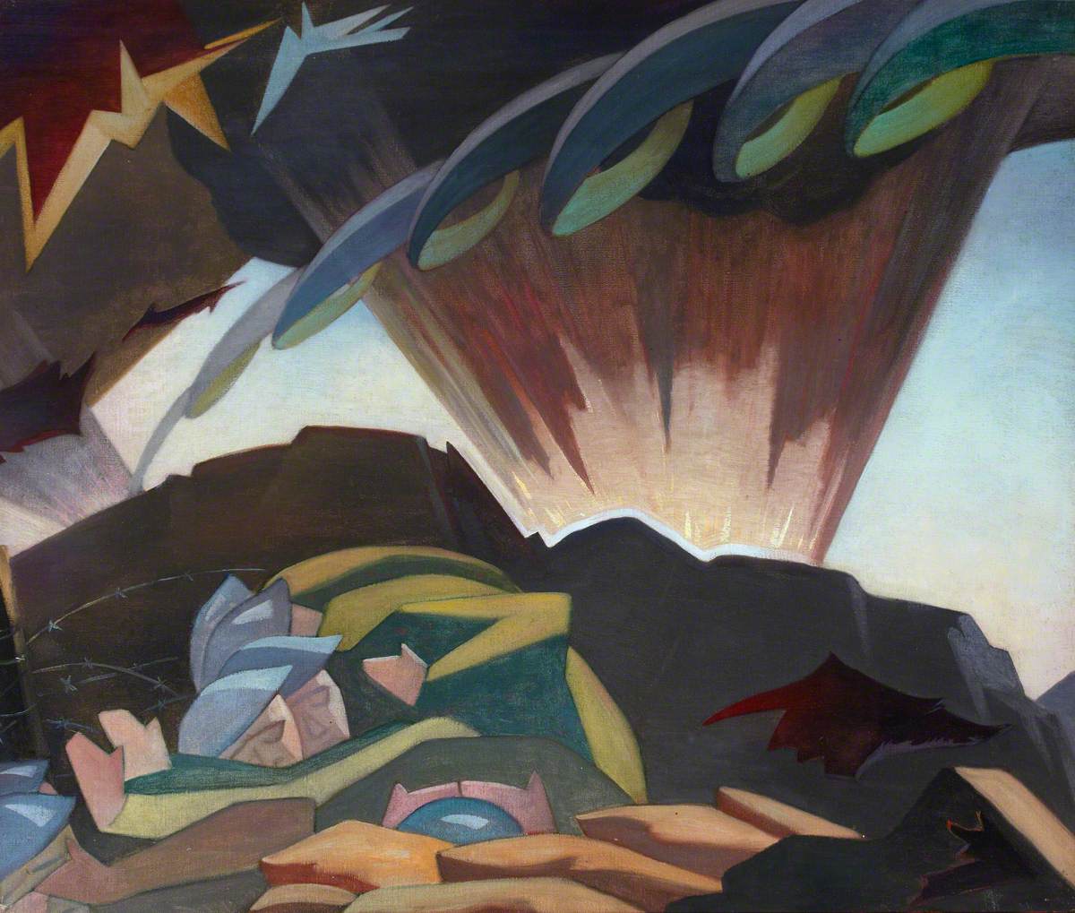
Another evocation of war is in Eric Robertson’s “Shellburst”:-
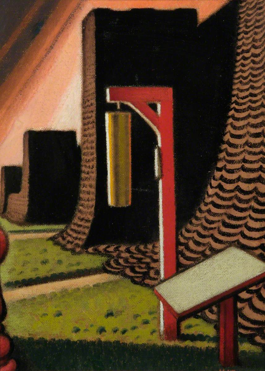
So too does Keith Henderson’s “Camouflage Hangars and Gas Gong”:-
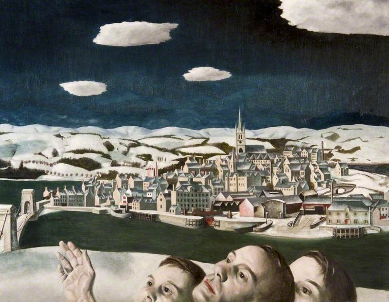
The caption for Edward Baird’s “Unidentified Aircraft over Montrose” is odd as it says the bridge at the lower left has since been replaced by a suspension bridge but the one depicted is clearly exactly of that type:-
William McCance’s “Study for a Colossal Steel Head” is very modernistic:-

Posted in Art, Empire Exhibition, Scotland, 1938, Exhibitions at 20:21 on 23 October 2017
A couple of weeks age we revisited the True to Life Exhibition at Modern Two, (Scottish National Gallery Of Modern Art,) Edinburgh.
I’ve left this a bit late as the exhibition is only on for a few more days now. Its full title is True to Life, British Realist Painting in the 1920s and 1930s.
I found this to be much more enjoyable than the Beyond Caravaggio exhibition recently finished at the Scottish National Gallery (see also here.)
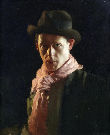
The first picture in True to Life, though, David Jagger’s “Conscientious Objector”, would not have looked out of place at that Beyond Caravaggio exhibition. It exploits light in much the same way as those did. This is apparently a self-portrait:-
“By the Hills” by Gerald Leslie Brockhurst features on the True to Life Exhibition catalogue cover though for me it’s a bit too sharply delineated. The artist was said to have used lipstick to paint the lips here:-

Another such too sharp picture was Meredith Frampton’s “A Game of Patience”:-

As with the David Jagger painting above Edward Baird’s “Dan Cross” also looks as if it could leap off the canvas. I feel as if I know this person:-

Keith Henderson’s The Harbour Crowd is another fine example of the capture of light. As I recall this painting was one of the exhibits in the Palace of Arts at the Empire Exhibition, Scotland, 1938. There was a black and white reproduction in the relevant souvenir booklet.

Some of the paintings in “True to Life” stretched the definition of realist somewhat.
Though it does contain figures (including the artist) “The Deluge” by Winifred Knights seemed to me to be at least influenced by Vorticism:-

Nora Russell by John Downton captures the impatient aspect of the early adolescent schoolgirl very well. I get the impression she didn’t really want to be painted:-